How to write AI image prompts that stay on brand
A repeatable way to brief AI image tools: define the look once, reuse it as a style block, and review results against your brand instead of your mood.
Getting one good image out of an AI tool is easy now. Getting twelve images that look like they came from the same company is much harder. Most teams hit this quickly: the homepage hero is warm and grainy, the blog covers look like stock photos, and the social images belong to a third brand altogether.
The cause is usually the prompts, not the model. When every image starts from a blank box, every image gets a fresh set of decisions about light, colour and composition. This guide shows how to make those decisions once, write them down, and reuse them, so your images hold together however many people are generating them.
Describe your look before you write a prompt
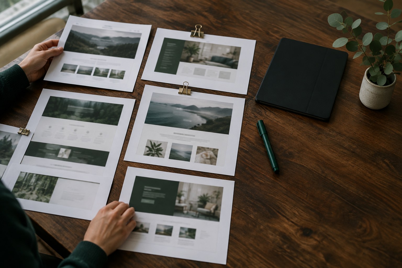
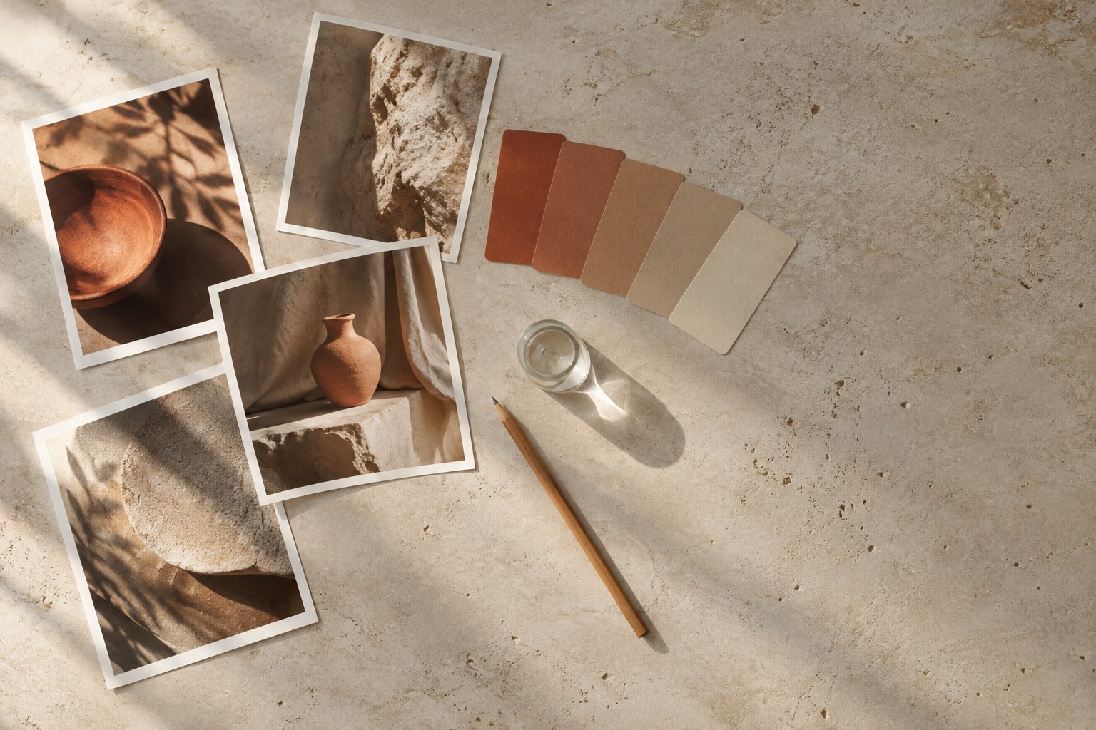
You cannot prompt for a style you have not defined. "Clean and modern" tells a model almost nothing, and it will not tell your teammate much either. Instead, collect ten to fifteen images you consider on brand, then write down what they have in common. Be literal about what you can see.
These are the questions we would answer first:
- Medium: photograph, illustration or something else? If it is a photograph, is it documentary, studio or editorial?
- Light: soft window light, hard midday sun or evening lamps? Where does it come from?
- Colour: which two or three colours dominate, and how saturated are they?
- Composition: how close is the camera, and how much empty space is there?
- Subjects: what appears in your images, and what never should?
If you cannot answer one of these, that is useful to know. It means your brand has not made that decision yet, and a model will make it differently each time.
Turn the answers into a reusable style block
Compress your answers into a short paragraph that you paste into every prompt. Keep it to details that should stay the same across images. A style block for a calm consulting brand might look like this:
Editorial documentary photograph. Soft window light from the left. Muted palette of deep green, oak and warm white. Medium distance, 50mm lens, shallow depth of field. Plenty of empty space on one side. No text, no logos, no visible faces.
Store this block somewhere the team already looks, such as your brand guidelines or a shared Figma page. Give it a version number too. When someone improves it, everyone should move to the new version together, or your images will slowly drift apart again.
Keep the subject separate from the style
A useful prompt has two parts: what changes and what stays the same. The subject line changes with each image, and the style block does not. Writing them separately stops you from accidentally rewriting the look each time you need a new scene.
- Write one sentence describing the subject and what is happening.
- Add one sentence of context that is specific to this image, such as the location or time of day, if your brand allows it to vary.
- Paste the style block unchanged.
- Add the exclusions you need for this image.
This also makes bad results easier to diagnose. If the scene is wrong, fix the subject line. If the mood is wrong, fix the style block, and every future image benefits.
Decide what is allowed to vary
Consistency does not mean every image should look alike. A set of images with identical angles and colours looks repetitive, and readers stop noticing it. So write down which variables are free and which are fixed.
For example, you might fix the colour temperature, realism level and amount of empty space, while letting the scene, the camera angle and the time of day change. That gives you variety that still reads as one brand. If your images keep falling into the same scene, name that habit in your exclusions and add a short list of alternative settings to choose from.
Generate in small batches and review against a checklist
Reviewing by gut feeling tends to reward whatever looks most impressive in the moment, which is not always what fits your brand. Generate a few options at a time, then score them against a short checklist:
- Would this sit comfortably beside your last three images?
- Does the light match the style block?
- Is there room for a headline or a crop, if the layout needs one?
- Are hands, objects and reflections believable at full size?
- Is there any garbled text or fake logo hiding in the background?
Check at full resolution, because small previews hide most of these problems. It also helps to place the candidate into the real layout before you approve it. An image that looks great alone can feel wrong beside your typography.
Use references when words stop working
Some qualities are hard to describe, such as the texture of a particular film stock or the way a brand uses shadow. If your tool supports image references, use your approved images as inputs and keep the written style block alongside them. Be careful about what you feed in, though. Use images you own or have the rights to, and check your tool's terms on commercial use, especially for client work.
When a result is close but not right, change one thing at a time. Rewriting the whole prompt can lose what was working, and you will not learn which change made the difference.
Build a small library as you go
Each approved image is also a record of what worked. Save it with the exact prompt, the model and the date. After a few months, you will have a reference set that makes new work faster and helps new team members get up to speed.
Models also change, and an update can shift your results even when your prompt stays the same. A saved set gives you something to compare against. When a new model arrives, regenerate a few known prompts, compare them side by side, and update your style block if you need to.
The prompt itself is the smallest part of this system. The real work is deciding what your brand looks like, writing it down clearly, and checking each image against it. Start with one style block and your next five images, and adjust from there. You will see within a week whether your images are starting to look like they belong together.