How to use AI for moodboards without losing originality
Use AI image tools to explore art direction quickly, without generic results or copying someone else's style.
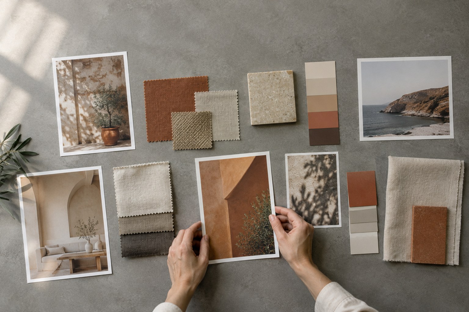
Moodboards are one of the most useful steps in a design project and one of the easiest to rush. A good board aligns you and the client on a direction before you spend hours on layouts. A weak one is a collection of pretty screenshots that nobody can explain.
AI image tools can help a lot here. They let you explore directions quickly, show things that do not exist yet and test colour and mood before committing. They can also lead you straight into generic work, or into images that copy someone else's style too closely. Here is how we use AI for moodboards and art direction while keeping the result original and useful.
Start with words, not images
Before you open any tool, write down what the brand should feel like in plain language. Three to five adjectives, a short description of the audience and one or two things the brand should not feel like. For example: "calm, precise, warm, a little playful; for small finance teams; not corporate, not cold".
This short brief does two jobs. It gives you better prompts, and it gives you a way to judge the results. Every image on the board should support at least one of these words.
Generate directions, not final images
The best use of AI at this stage is breadth. Instead of trying to get one perfect image, generate several clearly different directions:
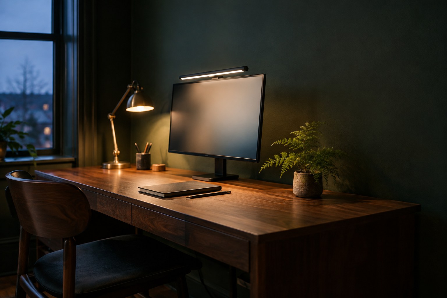
- Light and material: morning daylight on paper and wood versus evening lamp light on glass and metal.
- Colour: one restrained palette, one bolder palette, one almost monochrome.
- Composition: tight close-ups versus wide environmental scenes.
- Photography style: documentary, still life, editorial portrait seen from behind.
Label each set with its direction name. Clients react better to "Direction A: Quiet studio" than to a grid of unlabelled images.
Write prompts that describe, not imitate
The fastest way to get derivative work is to prompt with names of living artists, photographers or brands. Describe what you want instead: the light, the lens, the materials, the palette, the mood and the composition.
- Subject and setting: "a ceramic cup on a linen tablecloth by a window".
- Light: "soft overcast daylight from the left".
- Camera: "50mm lens, shallow depth of field, eye level".
- Palette: "stone, sand and one muted green accent".
- Mood: "quiet, unhurried, tactile".
Descriptive prompts give you more control and produce images that belong to your project, not to someone else's portfolio.
Mix AI images with real references
A board made only of generated images often feels a little too smooth. Mix in real references: photos you take yourself, material samples, type specimens, product shots from the client and screenshots of interfaces with good patterns. Real references ground the board in things that can actually be produced.
Mark which images are AI-generated. It keeps expectations honest. A client who falls in love with a generated photo needs to know that the final site will use a real photoshoot, licensed stock or carefully art-directed generated images, and that each option has a different cost.
Turn the board into art direction rules
A moodboard is only useful if it leads to decisions. Once the client picks a direction, write it down as rules your team, a photographer or an AI tool can follow:
- Light: natural, soft, from the side; no hard flash.
- Palette: three named colours plus one accent, with hex values.
- Subjects: hands, objects and workspaces; people seen from behind or in profile.
- Composition: generous negative space on one side for headlines.
- Avoid: neon colours, 3D renders, visible logos, stock-photo smiles.
These rules become the basis for every image prompt, photo brief and stock search later in the project. They are also what keeps a site consistent when the client adds images after launch.
Check rights and usage before anything ships
Moodboard images are for internal exploration. Final images are a different matter. Before a generated image goes on a live site, check the terms of the tool you used for commercial use, make sure the image does not include recognisable people, logos or trademarks, and keep a record of the prompt and tool. If the client works in a regulated industry, ask whether they have a policy on AI imagery.
Use AI to explore widely, then use your judgement to choose narrowly.
Present the board in context
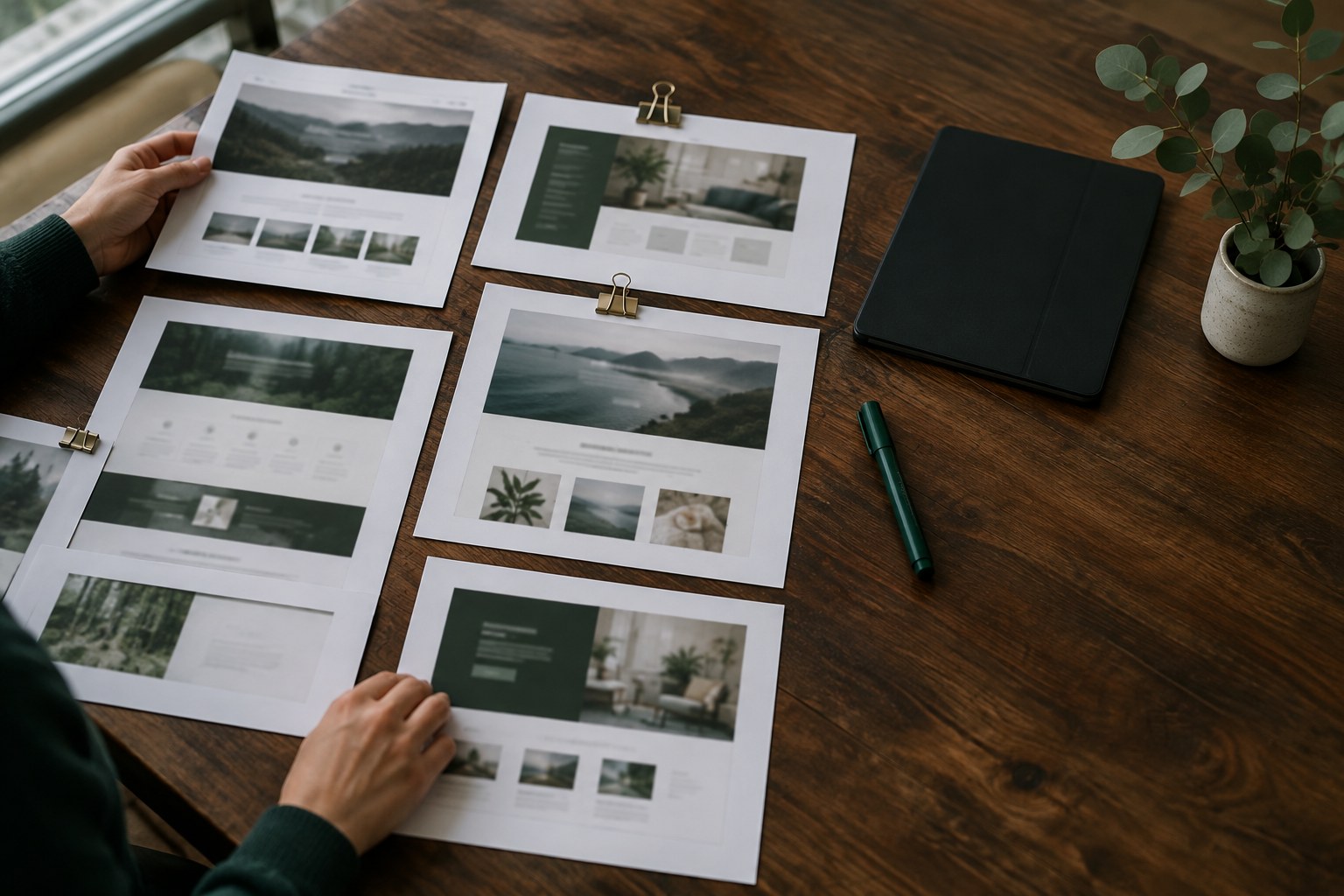
Do not present a moodboard as a loose grid. Show each direction next to a rough homepage hero or a social post using the same images and palette. Clients find it much easier to choose when they can see how a direction would actually look on their site.
Keep the presentation short: the brief, two or three directions, a recommendation and the reasons for it.
Expect the client to mix directions, for example the palette from one and the composition from another. That is fine, and often a sign the exercise worked. Capture the combination in writing straight away, regenerate a few images that match it and confirm it in the follow-up email, so the decision does not drift during the project.
Conclusion
AI makes moodboards faster and broader, but the value still comes from the brief behind them and the decisions after them. Start with words, explore several clearly different directions, describe instead of imitating, mix in real references and turn the chosen direction into written rules. That way AI speeds up your art direction without replacing your taste.