How to set up colour and text styles in Framer
Set up colour and text styles in Framer before you build pages, so your site stays consistent, scales across breakpoints and is easy to hand off.
Most Framer sites that feel messy six months after launch have the same problem: colours and type were set by hand on each layer. One heading is 48px, another is 46px, there are four slightly different greys, and nobody remembers which one is the "real" brand blue. Every small change turns into a hunt across pages.
Colour and text styles fix this. They take an hour to set up at the start of a project and save many hours later, for you and for the client who edits the site after you. Here is how we set them up on every Framer build.
Why styles matter on a Framer site
A style is a named, reusable value. When you change the style, every layer that uses it updates. That gives you three things:
- Consistency: every heading and every button colour comes from the same small set of values.
- Speed: a rebrand or a contrast fix becomes a few edits instead of a page-by-page search.
- Safer handoff: clients pick from named styles instead of inventing new sizes and colours.
Set styles up before you build pages. Adding them later means going back through every layer, and some layers always get missed.
Start with a small colour palette
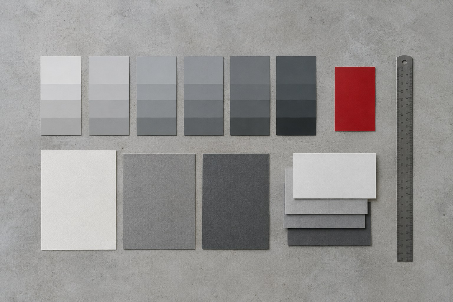
Before you open Framer, decide on the palette. For most marketing sites you need fewer colours than you think: a background, a surface for cards, one or two text colours, a border colour, a primary brand colour and maybe one accent. Add states such as hover only when you actually need them.
Check contrast at this stage, not after the site is built. Body text on your background and button text on your primary colour should both pass WCAG AA. Fixing contrast in the palette is much easier than fixing it on twenty pages.
Name colours by role, not by value
This is the most useful habit in the whole setup. Instead of naming styles "Blue 500" or "Light Grey", name them by what they do:
- Background and Surface for page and card backgrounds.
- Text / Primary and Text / Secondary for body and muted text.
- Border for dividers and outlines.
- Brand / Primary and Brand / Accent for buttons, links and highlights.
Role-based names mean you can change the actual colour later without the names becoming wrong. They also make dark mode much easier, because "Background" can be light in one theme and dark in the other. Using a slash in the name groups related styles together in the assets list, which keeps a longer palette tidy.
Plan for dark mode from the start
Framer colour styles can hold separate values for light and dark themes. If there is any chance the site will need a dark version, set both values as you create each style. With role-based names, the dark values are usually quick to decide: swap background and text, slightly lift surfaces, and check that your brand colour still has enough contrast on a dark background.
Even if the client says "light only" today, filling in dark values costs little and keeps the option open.
Build a simple type scale
For text styles, start with a scale rather than individual sizes. A typical marketing site needs:
- A display or hero heading.
- Heading 1, Heading 2 and Heading 3.
- Body, plus a larger lead paragraph.
- Small text for captions, labels and footers.
- A button or label style if it differs from body.
Set the font, weight, size, line height and letter spacing in each style. Large headings usually want tighter line height and slightly reduced letter spacing; body text wants more generous line height for reading. Keep the number of fonts and weights small: two families and three or four weights cover most sites and load faster.
If you find yourself creating "Heading 2 Big" and "Heading 2 Small", your scale has a gap. Fix the scale instead of adding exceptions.
Make type responsive across breakpoints
A 72px hero heading that looks right on desktop will often wrap badly on a phone. Instead of overriding sizes on each breakpoint by hand, set the responsive sizes inside the text styles themselves where possible, so each style knows its tablet and phone size.
Test the real content at each breakpoint, especially long words, translated text and CMS titles. Check the longest blog title on mobile; it is usually the first thing to break.
Apply styles everywhere, then clean up
Once your styles exist, use them on every text layer and every fill. When you build components such as buttons, cards and navigation, connect their colours and text to styles too, so a single change flows through components and pages.
Before launch, do a quick audit. Look for text layers with no style applied and fills set to a raw colour. Fix them or, if a one-off value is truly needed, ask whether it should become a style. Finally, delete styles nobody uses so the list stays short and clear.
Hand off styles the client can understand
A clean style list is part of your handoff. Walk the client through it: which styles to use for headings, body text and buttons, and which ones to leave alone. Tell them to pick from existing styles rather than changing sizes or colours directly on layers. If their team edits content in the CMS, check that rich text fields map to your text styles, so new posts look like the rest of the site.
Conclusion
Colour and text styles are the quiet foundation of a Framer site that stays consistent. Start with a small palette named by role, add dark values early, build a clear type scale with responsive sizes, and apply styles to every layer and component. It is one of the cheapest things you can do to make a site easier to maintain, for you and for whoever edits it next.