How to design a dark mode that isn't just inverted colours
Inverting a light theme rarely works. Here is how to choose dark surfaces, show depth, adjust brand colours and test contrast so your dark mode holds up.
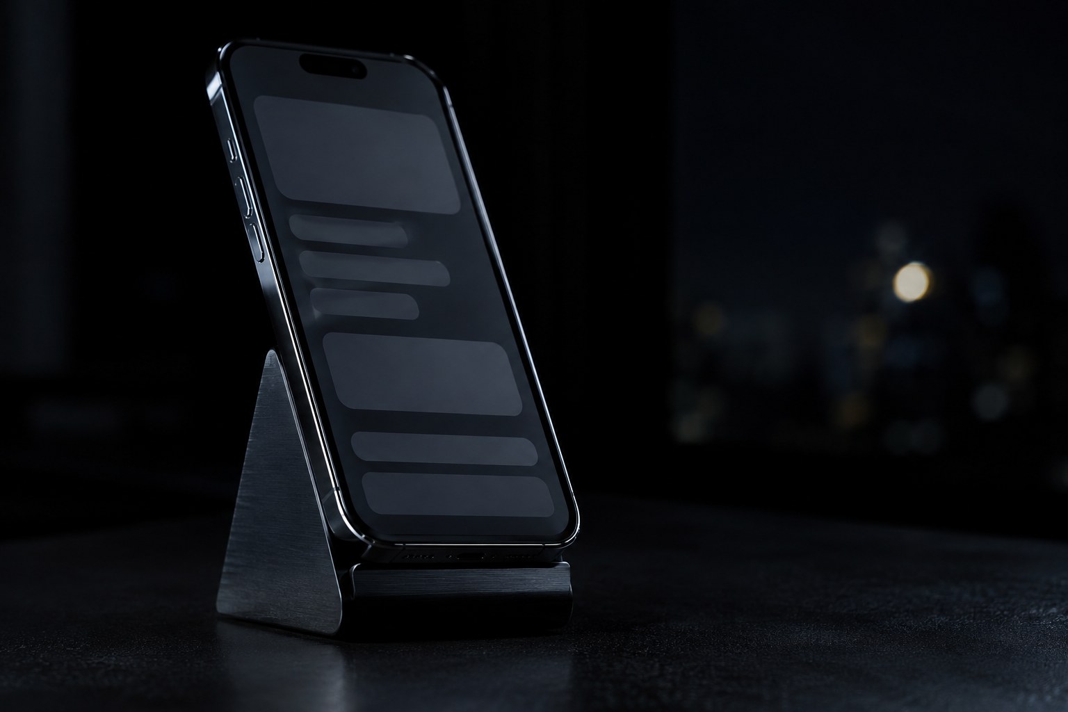
Flipping a light interface to dark takes about five minutes, and it usually looks like it. Cards lose their edges, brand colours start to buzz against the background, grey text fades away, and the shadows that held your hierarchy together disappear.
A good dark mode is a second set of design decisions built on the same structure. It does not need to take months, but it does need a plan. This guide covers the choices that matter most: surfaces, depth, text, colour and testing, using Google's Material dark theme codelab and the WCAG contrast requirements as reference points.
Start with colour tokens, not screens
If your components use raw hex values, dark mode turns into a long search and replace. Name your colours by their job first, so a component asks for "surface" or "primary text" and not for a specific grey. Each name can then hold one value per theme.
In Figma, this usually means a variable collection with light and dark modes. A small starting set might look like this:
- Surfaces: background, raised surface, overlay.
- Text: primary, secondary, disabled.
- Borders: subtle, strong.
- Actions: primary, primary hover, focus ring.
- Status: success, warning, error, each with a background and a foreground.
Keep the list short at first. You can add more when a real screen needs one, and you will avoid dozens of tokens nobody can tell apart.
Choose a dark grey as your base
Your background sets the tone for everything above it. Material's guidance uses a dark grey, typically #121212, as the bottom layer. That is a useful reference, not a rule. A slightly tinted base can carry some brand character, as long as the tint stays subtle enough that images and status colours still look right.
A dark grey also leaves room to go darker and lighter. If your base is already pure black, you have less range for showing an element sitting behind another one, and the jump to bright text is at its harshest. Some products do offer a true black option, but treat it as a deliberate choice for a specific reason, not as the default.
Show depth with lighter surfaces
Shadows do most of the work in a light theme, but they are hard to see on a dark background. So dark themes usually reverse the logic: the closer a surface is to the viewer, the lighter it gets. Material does this with white overlays. The more elevated a surface is, the stronger the overlay. In its codelab, an email card uses white at 2% and a bottom app bar uses a stronger overlay at 12%.
You do not need to copy those numbers. Three or four steps are enough for most products:
- The page background.
- Cards and sections on the page.
- Menus and popovers above those cards.
- Modals, if they need to stand further apart.
If two neighbouring steps look identical on your monitor, they will almost certainly look identical on a dimmer laptop. A thin, subtle border can help when you need a clearer edge.
Soften your text, but keep it readable
Pure white body text on a dark surface can feel too bright. Material's codelab notes that its light can appear to bleed or blur, which hurts legibility. Instead, it uses white at reduced opacity for different levels of emphasis:
- High emphasis: 87% opacity.
- Medium emphasis: 60% opacity.
- Disabled: 38% opacity.
Then check those values against your real surfaces. WCAG 2.2 asks for a contrast ratio of at least 4.5:1 for normal text and 3:1 for large text, which means at least 18 point, or 14 point bold. Those thresholds are not rounded, so 4.499:1 does not pass. Secondary text is the usual place this goes wrong, especially on raised surfaces, because they are lighter than the page background.
Text can also look heavier when it is light on dark. Compare your body copy in both themes, and if it feels thick, try a lighter weight where your font allows it.
Adjust brand colours instead of reusing them
This is where inverted themes usually fail. A saturated brand colour that works on white can become hard to read on dark grey. Material's codelab describes more saturated colours as tending to "vibrate" against darker backgrounds, which is why it picks lighter tonal variants instead.
Treat your brand colour as a family. Keep the hue recognisable, then choose a lighter, calmer version for dark mode. Check three cases separately, because they often need different values:
- Text and links on a dark surface.
- A filled button and the label sitting on it.
- Status colours, especially red and yellow, which can be either too harsh or too muddy.
The same goes for charts. A palette tuned on white may lose its distinctions on dark, so check that series stay easy to tell apart.
Don't forget images and illustrations
A bright photo on a dark page can be the loudest thing on screen. Illustrations with transparent backgrounds can also lose dark lines entirely, and a black logo may vanish. Go through your assets and decide on a fix for each type: a light version of the logo, a redrawn or lightly tinted illustration, or a soft container behind product shots.
Screenshots deserve special attention. A light UI screenshot in a dark marketing page can look jarring, so show the product in its dark theme where it makes sense.
Test it where people use it
A calibrated monitor in a bright studio is the least demanding place to judge a dark theme. Before you ship, check it in the conditions it was designed for:
- On a phone in a dark room, at low brightness.
- On a laptop in daylight, where subtle surface differences tend to vanish.
- Through every state, including hover, focus, disabled, error and empty.
- With a contrast checker on real token pairs, not just the ones you expect to pass.
Give people control as well. Follow the system setting by default, and offer a manual switch where it makes sense.
You do not need to convert everything at once. Pick your most-used screen, build the tokens it needs, and test it properly. If that one screen holds up in a dark room and in daylight, you will have a system you can extend to the rest of the product.