How to review AI-generated UI before it ships
A practical review pass for AI-generated screens: real content, missing states, accessibility numbers, invented copy and system mismatches.
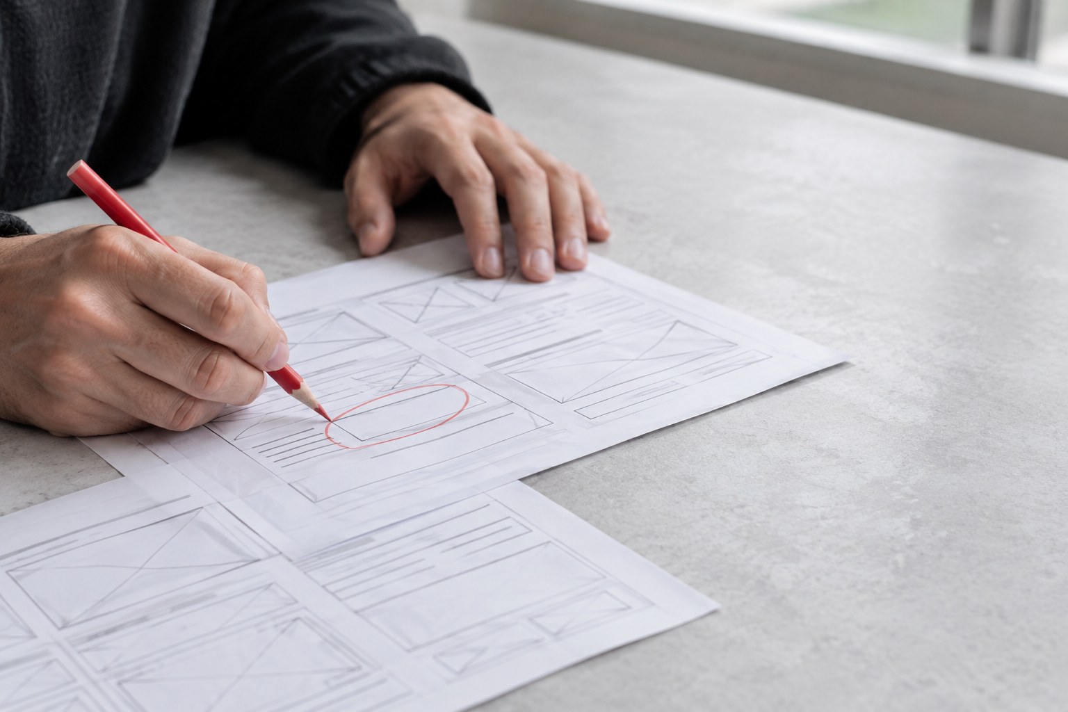
AI tools can now produce a plausible interface in under a minute. Describe a settings page or a pricing section, and you get something with sensible spacing, tidy cards and copy that reads fine at a glance. The trouble is that "fine at a glance" is exactly what these tools optimise for. The problems show up later, when a real person tries to do something with the screen.
So the skill that matters is no longer only making the first draft. It is reviewing a draft you did not make, quickly and with a clear idea of where it tends to fail. This is the review pass we use on generated UI, whether it came from a prompt-to-design tool, a code assistant or a template generator. It works the same way for all of them, because the weak spots are consistent.
Start with the job, not the picture
Before you judge a single pixel, write down in one sentence what the person on this screen is trying to do. "Change the card on my subscription." "Decide which plan fits a team of five." If you skip this, you will review the screen as an image, and generated screens are very good images.
Then ask two questions:
- Is the primary action obvious within a few seconds? Generated layouts often give three things equal weight because the prompt listed three things.
- Is anything on the screen unrelated to that job? Tools like to fill space with stat tiles, activity feeds and "quick actions" nobody asked for. If you cannot name who needs it, cut it.
Removing content at this stage saves you from polishing things that should not exist.
Replace the sample content with real content
Generated UI is almost always built around flattering data: short names, round numbers, three items in every list, a photo for every card. Real products are messier. Swap in the content you actually have and watch what breaks.
- A 40-character name in a field designed for "Anna Lee".
- A price with a currency symbol and a long number, such as 12,500,000 in a local currency.
- One item in a grid built for three, and then forty.
- Text in a second language, which is often considerably longer than the English.
- A missing image or missing description.
This single step catches more real problems than any visual critique, and it takes about ten minutes.
Ask for the states the prompt never mentioned
A prompt describes the ideal moment, so the output shows the ideal moment. Everything around it tends to be missing or invented on the spot. Make a short list and check each one exists and makes sense:
- Empty: what does a new user see before there is any data?
- Loading: does the layout hold, or does it jump when content arrives?
- Error: does the message say what went wrong and what to do next, and does it keep what the user already typed?
- Disabled and read-only: can people tell why something is unavailable?
- Hover, focus and pressed: are they present on every interactive element, or only on the main button?
- Success: does anything confirm that the action worked?
You can often get these by asking the same tool for them one at a time. Asking for "all states" at once usually gets you shallow versions of each.
Test accessibility with numbers, not impressions
Generated interfaces love low-contrast grey text and small, tidy controls. Both look refined and both exclude people. Check the specifics rather than trusting your eye:
- Contrast: WCAG AA asks for 4.5:1 on normal text and 3:1 on large text and on the visible boundaries of controls. Placeholder text and muted captions are the usual failures.
- Target size: WCAG 2.2 AA sets a 24 by 24 CSS pixel minimum. Apple's guidance is 44pt and Material's is 48dp, so aim for those on touch screens.
- Keyboard: tab through the whole screen if it exists in code. Look for a visible focus ring and a logical order.
- Structure: check that headings are real headings, fields have real labels, and icon-only buttons have accessible names. Generated code frequently uses a clickable div where a button belongs.
Read every word as if it were wrong
Copy is where generated UI sounds most convincing and is least reliable. It will happily state things your product does not do. Read through with a pen, and look for:
- Invented facts: feature claims, customer counts, testimonials, security badges and uptime figures that nobody supplied. These are a legal and trust problem, not a style problem.
- Vague buttons: "Get started" and "Learn more" where "Create invoice" would tell people what happens next.
- Inconsistent terms: "workspace" on one screen and "team" on the next, for the same thing.
If a sentence could appear on any product's website, it is probably not doing any work on yours.
Check it against your system, not against itself
A generated screen is usually consistent internally, which makes it easy to miss that it does not match anything else you have. It may use a slightly different radius, a new shade of grey, or a custom button that duplicates a component you already own.
Inspect the values rather than the look. In Figma, check whether fills and text use your variables and styles or raw values. In code, search for hardcoded colours and one-off spacing. Each small mismatch is cheap on its own, but they accumulate quickly, and a few weeks of unreviewed output can leave you with several versions of the same card.
Put a time limit on fixing
Sometimes the honest conclusion is that the draft has the wrong structure. Patching a flawed layout through ten rounds of prompts usually takes longer than starting again with what you now know. A useful rule: if the task flow or hierarchy is wrong after two correction attempts, stop editing and rewrite the prompt, or build that part by hand.
Generated output is a first draft from a fast junior colleague who has never met your users. Review it with that in mind.
Treat the output as raw material. Keep the parts that hold up and do not feel obliged to rescue the rest just because it was quick to produce.
Conclusion
The whole pass takes 20 to 30 minutes for a typical screen: job, real content, missing states, accessibility numbers, copy, system match. Run it in that order, because the early checks often remove work from the later ones. The speed of AI drafts only pays off if the review is strict enough that you would put your name on the result.