How to calibrate your monitor for design work
Which calibrator to buy, which targets to set for screen and print work, and how to build a calibration routine that sticks.
You've spent an afternoon choosing the exact shade of orange for a client's buttons. Then they open the site on their laptop and ask why it looks red. Sometimes that's their screen. But often the problem is closer to home: your own monitor has drifted, or it was never set up accurately in the first place, so every colour decision you make sits on a slightly tilted floor.
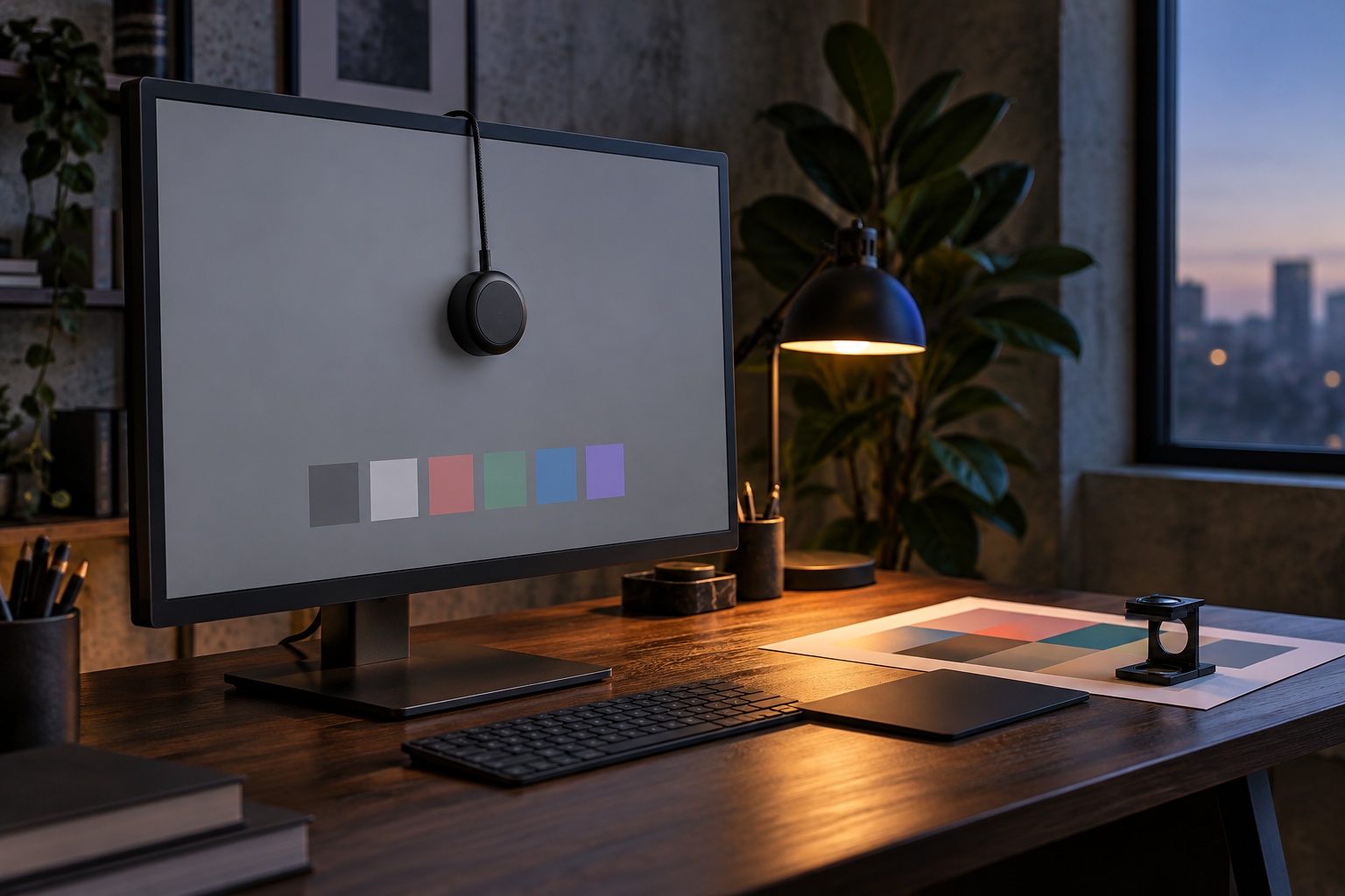
Calibration fixes that floor. A small sensor measures what your screen actually shows, and software builds a profile that corrects it toward an agreed standard. It takes a few minutes, and the hardware costs less than most monitors' stands. Here's what to buy, which settings to choose and how to make it a habit.
Why your eyes aren't enough
Built-in calibration assistants that ask you to match grey patches by eye are better than nothing, but your eyes adapt to whatever is in front of them. Spend ten minutes looking at a screen that's slightly too blue and it starts to look neutral. A colorimeter doesn't adapt. It measures light objectively and gives you the same answer every time.
Monitors also change over time. Backlights age and output drifts, which means even a factory-calibrated screen will slowly move away from the numbers on its calibration report. Regular measurement is the only way to know where you stand.
Check your screen type before you buy a calibrator
This is the step people skip, and it's the one that causes problems. Colorimeters are built to read particular display technologies and brightness ranges. Bright mini-LED and OLED screens, including many recent laptops, need a sensor that can handle them.
According to Digital Camera World's calibrator buying guide, the entry-level Calibrite Display 123 can't calibrate screens brighter than 1,000 nits and isn't suitable for mini-LED displays, including current MacBook Pro models. So before comparing prices, write down:
- Every screen you design on, including your laptop.
- Each screen's panel technology (IPS LCD, mini-LED, OLED).
- Its peak brightness.
- Whether you also need to profile a printer.
Current calibrators and who they suit
Here's how the current options from that guide line up, with the prices it listed:
- Calibrite Display 123 ($129): a simple three-step wizard for standard monitors up to 1,000 nits. A good fit if you work on one conventional LCD screen.
- Datacolor SpyderPro ($269, often discounted): reads standard and HDR LCD, mini-LED, Apple XDR displays and OLED up to 2,000 nits, supports multiple displays and measures ambient light.
- Calibrite Display Plus HL ($279): handles up to 10,000 nits and covers mini-LED, OLED and Apple XDR displays, with video standards such as Rec.709. Worth it if you use very bright screens or touch video work.
- Calibrite ColorChecker Studio and Datacolor Spyder Print Studio (around $500): kits that also profile printers, for designers who sign off on print.
For most web and product designers with a recent laptop plus an external monitor, a calibrator that supports mini-LED and OLED is the safer buy, even if your current external monitor doesn't need it.
Choosing your calibration targets
Calibration software asks for target values. The right ones depend on where your work will be seen and how bright your room is. Image Science's guide to calibration targets recommends these starting points:
For screen and web work
- White point: 6500K (D65), which matches sRGB and most device screens.
- Gamma: 2.2.
- Brightness: 100 to 120 cd/m² in a dim room, 120 to 160 cd/m² in a bright one.
- Gamut: sRGB is the most compatible choice when you don't know how your work will be viewed.
For print work
- Brightness: around 90 cd/m², so the screen isn't brighter than paper under normal light.
- White point: around 5800K, which the guide says often matches typical viewing conditions better than D65.
- Gamma: 2.2, with the monitor's native gamut so you can see colours outside sRGB.
A common mistake is running a design monitor at maximum brightness. It looks vivid, but it makes your designs look darker and muddier on other screens once you lower it, and it makes print proofs look dull next to the screen.
Set up your room and run the calibration
The room affects what you see, so a few habits make the measurement more useful:
- Let the monitor warm up for at least half an hour so its output stabilises.
- Reset the monitor to its factory or standard mode and turn off dynamic contrast, eco modes and automatic brightness.
- Keep lighting the way it normally is when you work, and avoid direct light falling on the screen.
- Hang the sensor flat against the centre of the screen and don't touch the desk while it measures.
- Save the profile with a clear name and date, so you can tell which one is active.
If your calibrator measures ambient light, use it. It can suggest a brightness target that suits your room rather than a generic number.
Make calibration a routine
Calibration isn't a one-off. Most calibration software can remind you when the next check is due, so turn that on. Many designers recalibrate monthly; set a recurring calendar reminder if you prefer. Recalibrate sooner if you move desks, change your room lighting or update your graphics drivers or operating system.
Remember that calibration makes your screen accurate, not your users' screens. Keep testing important colours on a real phone and a typical laptop before you sign off. The goal is to make decisions from a reliable reference, so that when something looks wrong on a client's device, you know it isn't your monitor.
Conclusion
Monitor calibration is one of the cheapest upgrades you can make to your design work. Check what kind of screens you use, pick a colorimeter that supports them, set targets that match where your work will end up, and repeat the process on a schedule. A few minutes a month gives you a stable reference for every colour decision you make.