How to design form errors that help users finish
Practical rules for when form errors appear, what they say and where they sit, so more people finish your signup and checkout flows.
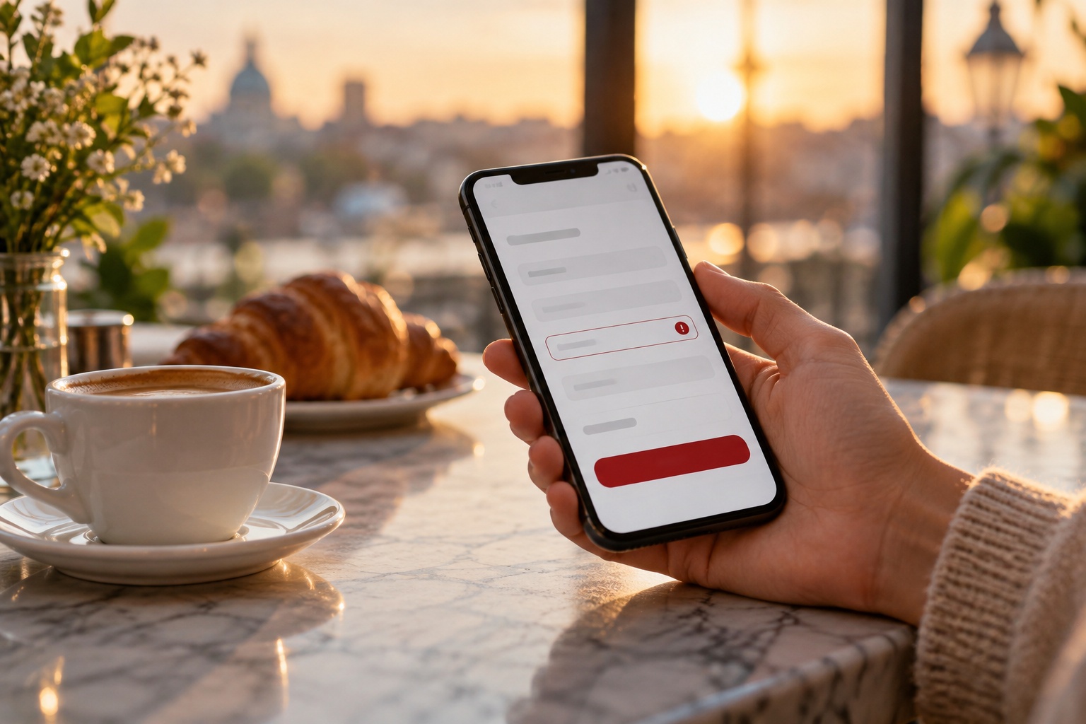
Most people who abandon a form don't leave because the form is long. They leave because something went wrong and the form didn't help them fix it. A red border with no explanation, an error that appears only after they hit submit, a password rule they could not have guessed: each one is a small moment of friction, and friction at the end of a signup or checkout flow is expensive.
The good news is that form errors are one of the most fixable parts of any product. You don't need a redesign. You need a handful of clear rules about when errors appear, what they say, and where they sit. Here is the approach we use when we design or audit forms for clients.
Prevent the error before you design the message
The best error message is the one nobody sees. Before you write copy for a failed state, ask whether the field needs to be able to fail at all.
- Accept flexible input. Phone numbers with spaces, dashes or brackets should all work. Strip the formatting in code instead of asking the user to do it.
- Show the rules up front. If a password needs 10 characters and a number, say so under the field before anyone types.
- Use the right input type. Email, number and date inputs bring the correct mobile keyboard and remove a whole class of typos.
- Cut fields you don't need. Every optional field you remove is an error state you never have to design.
Once you've done this, the errors that remain are the ones that matter: real mistakes the user can correct.
Validate at the right moment
Timing is where most forms go wrong. Validate too early and you shout at people mid-word. Validate too late and they scroll back through a wall of red after submitting.
A pattern that works well in practice:
- Don't validate while the user is still typing in a field for the first time. Typing "jo" into an email field is not an error yet.
- Validate when the user leaves the field. On blur, check the value and show an error if it's wrong.
- Once a field has an error, re-check as they type. The moment the value becomes valid, remove the error. This turns correction into instant positive feedback.
- Validate everything on submit as a safety net, and move focus to the first field with a problem.
This "reward early, punish late" approach keeps the form calm while people fill it in and responsive while they fix it.
Write messages that say what to do next
An error message has one job: tell the person how to get unstuck. "Invalid input" fails that job. So does "Error 422". Compare these:
- "Invalid email" → "Add an @ and a domain, like name@studio.com"
- "Password does not meet requirements" → "Add at least one number"
- "Date is invalid" → "Use a date after today"
Good messages are specific, short and written in plain language. They describe the fix, not the failure. Avoid blaming words like "wrong" or "illegal", and avoid jokes. Someone who just lost their card details to a timeout is not in the mood.
If you can't explain how to fix the error in one short sentence, the field probably has a design problem, not a copy problem.
Put the message where the eye already is
Placement decides whether a message gets read. The user is looking at the field they just touched, so the message belongs right next to it, usually directly below the input and above the next label.
A few placement rules we stick to:
- Keep space reserved for the message, or animate it in smoothly, so the layout doesn't jump and push the next field away from the cursor.
- Replace the helper text with the error rather than stacking both. Two lines of grey and red under one field is noise.
- For long forms, add a short summary at the top after a failed submit, with links that jump to each problem field.
- Never rely on a toast notification for field errors. It disappears before people find the field it refers to.
Don't let colour do all the work
A red border is the most common error signal, and on its own it is one of the weakest. Around one in twelve men has some form of colour vision deficiency, and red-on-white borders are easy to miss on a bright phone screen in daylight.
Pair colour with at least two other signals: an icon, a text message, and a change in border weight. Make sure the error text itself meets contrast requirements against the background. In code, link the message to the input with aria-describedby and set aria-invalid so screen readers announce the problem when the field gets focus. If you're designing in Figma or Framer, add these notes to your handoff so they don't get lost between design and build.
Protect what people already typed
Nothing makes someone close a tab faster than losing their work. If the server rejects a submission, the form should come back exactly as they left it, minus only the values that are truly unsafe to keep, such as card security codes.
The same applies to multi-step flows. If step three fails, steps one and two should still be filled in when they return. Saving drafts locally for long forms, like applications or project briefs, is a small engineering cost that pays for itself the first time someone's connection drops.
Design the full set of states, not just the error
When you hand off a form, the error state is one of several states each field can be in. Designers often mock up the empty form and one red field, then leave the rest to the developer. A complete field component should cover:
- Default and focused
- Filled and valid
- Error, with message
- Disabled and read-only
- Loading, for fields that check availability, such as usernames
Build these as variants in one component. It keeps the form consistent, makes review faster, and gives developers a clear reference instead of a guess.
Test it with real mistakes
Forms are usually tested with correct data, which is the one scenario where error design doesn't matter. Before you ship, spend ten minutes filling the form in badly on purpose. Leave required fields empty, paste an email with a trailing space, type a date in the wrong format, submit twice, and switch off your connection halfway through. Then try it with a screen reader and on a small phone.
Every moment where you feel confused or annoyed is a moment your users will feel too, only with less patience.
Conclusion
Good form error design is mostly restraint and clarity: prevent what you can, validate at sensible moments, say exactly how to fix the problem, and never lose what people typed. None of these changes is large on its own, but together they decide whether a signup, checkout or contact form actually gets finished. Pick one form in your product this week, run the bad-data test, and fix the first three things that trip you up.