How to build a small device lab for testing your designs
Three to five well-chosen phones catch most of the problems previews miss. Here's which devices to buy, what to spend and how to test with them.
Figma's device preview and your browser's responsive mode are good at one thing: showing you a layout at a given width. They are bad at almost everything else that decides whether a design works. They don't show you how small a tap target feels under your thumb, how a light-grey label disappears on a cheap screen in daylight, or how a heavy hero animation stutters on a phone that costs a fifth of yours.
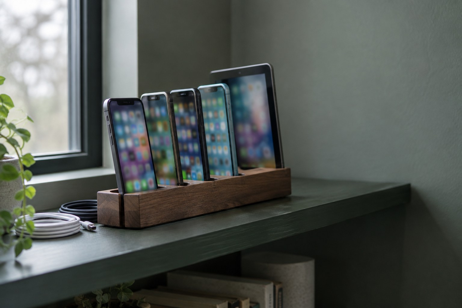
That is why we keep a small shelf of real devices. It doesn't need to be a lab with fifty phones. Three to five well-chosen devices will catch most of the problems your clients' users would otherwise find for you. Here is how to choose them, what to spend, and how to use them without turning testing into a second job.
Why real devices still matter
Emulators and design-tool previews render pixels correctly, but they hide the physical side of a design. On a real device you notice things you cannot see on a 27-inch monitor:
- Reach. Buttons in the top corners of a large phone are hard to hit one-handed. Bottom sheets and bottom navigation suddenly make more sense.
- Contrast in real light. A colour pair that passes on a calibrated display can still wash out on a budget LCD near a window.
- Performance. Scroll effects, video backgrounds and large images feel very different on a mid-range Android phone than on a new MacBook.
- System UI. Notches, the Dynamic Island, browser toolbars that collapse on scroll and on-screen keyboards all eat into your layout in ways a static frame doesn't show.
Start with what your users actually hold
Before you buy anything, look at the data. If the site or product already exists, open its analytics and check the device, operating system and browser reports for the last 90 days. If it's a new project, ask the client for data from a similar product, or look at public market share figures for the country you're designing for.
The split varies a lot by market. A product for designers in the US may be mostly iPhone and Safari; a consumer app in Central Asia, India or much of Europe will lean heavily towards Android and Chrome. Write down the top three or four device classes, not exact models. You are buying representatives, not a copy of every phone your users own.
The core kit: three devices that cover most cases
For most freelance designers and small studios, this combination covers the majority of real-world problems:
- A recent, affordable iPhone. Safari on iOS has its own quirks with fixed elements, viewport height and form inputs, and you can only see them on Apple hardware. The iPhone 17e is a sensible choice at $599 in the US, with a 6.1-inch screen that sits close to the small end of what people use today. If you already own a newer iPhone, a used older model works just as well for testing.
- A mid-range Android phone. The Google Pixel 10a starts at $499 and has a 6.3-inch 120Hz OLED display. It runs close-to-stock Android with Chrome, which makes it a clean baseline for how Android renders your work.
- A budget Android phone. This is the device most designers skip and the one that finds the most problems. Samsung's Galaxy A series sits around the $200 mark in the US; the Galaxy A17 5G is a typical example. Slower processors and less RAM show you exactly where your animations, images and scripts are too heavy.
If the product is used on tablets, add one more: an entry-level iPad is the most common tablet in most markets, and it is where many "desktop" layouts break because the width sits between your breakpoints.
Buy used, and buy older on purpose
A test device doesn't need to be new, and in many ways it is better if it isn't. Your users don't all upgrade every year, so a phone that is two or three years old is often a more honest test than this year's flagship.
A few rules we follow when buying second-hand:
- Check that the device still receives operating system and browser updates. A phone stuck on an old browser version tests a world your users have mostly left.
- Prefer refurbished stores with a warranty over private sellers for anything above a modest budget.
- Ignore cosmetic scratches. Screen burn-in and dead pixels matter; a scuffed back doesn't.
Set the devices up for testing, not for living
A test phone should be boring and predictable. Reset it, sign in with a dedicated test account rather than your personal one, and keep only the apps you need: the default browser, one or two alternative browsers, the Figma app for viewing prototypes, and the Framer or staging links you use most.
Then make a few deliberate settings changes so you can switch conditions quickly:
- Add accessibility shortcuts for larger text and reduced motion, so you can check both in seconds.
- Leave one device on the default font size and set another to a large size. Many real users run their phones that way.
- Turn off auto-brightness on one device and test at a lower brightness level, which is closer to how people use phones outdoors or at night.
Label each device with a small sticker showing the model and OS version. When you write up a bug for a developer, that detail saves a round of questions.
Fill the gaps with cloud testing
A physical shelf can't cover every model. For the long tail of devices, browser versions and screen sizes, cloud device services let you open a site on real phones hosted in a data centre and control them from your browser. They are useful for checking a specific bug a client reports from a phone you don't own, or for a final pass across many browsers before launch.
We treat these as a complement, not a replacement. Remote devices still don't let you feel reach, glare or the weight of a phone in your hand. Use them for coverage; use your shelf for feel.
A testing routine that fits into real projects
Devices only help if you actually pick them up. We build short checks into the moments where they catch the most:
- Early layout. As soon as a key screen exists as a prototype, open it on the smallest and the largest phone. Look for crowded headers, cut-off text and buttons out of thumb reach.
- Before client review. Run the main flow on the budget Android phone. If it feels slow there, fix images and motion before the client sees it.
- Before launch. Go through forms, navigation and checkout on every device, with large text and reduced motion turned on at least once.
Each pass takes ten to twenty minutes. Record what you find with a screen recording on the device itself; a short clip explains a layout bug faster than a paragraph.
What it costs, and how to justify it
New, the three-phone core kit above comes to roughly $1,300 at US list prices. Bought used or refurbished, you can often get a similar set for around half of that.
The first time a budget phone shows you a hero section that takes four seconds to become usable, the shelf has paid for itself.
You can also mention device testing in your proposals. Clients rarely ask for it, but they understand it immediately, and it is a concrete reason your work holds up after launch.
Conclusion
A small device lab is less about gear and more about habit. Pick devices that match your users, include at least one cheap Android phone, set them up for quick switching between conditions, and use them at three fixed points in every project. Cloud services can cover the rest. The result is fewer surprises after launch and designs that work in the hands of the people who actually use them.